Day and Night
Data Visualization
Calendar
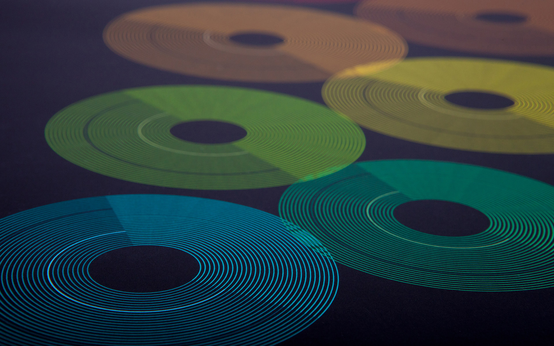
The challenge in my second semester was to create a data visualization in form of a calendar. For my topic I decided to use the rhythm of day and night during the period of the year 2012.
The twelve circles represent the months of the year, starting in the upper left corner. Each one is tagged with a different color that is adjusted to the average temperature of the month. Every circle consists of smaller circles visualizing the days of the month. With the help of a 24 hour clock the sunrise and the sunset were marked. The bright side of the circle shows the day while the dark side represents the night time. You can also find full and new moon in each month.
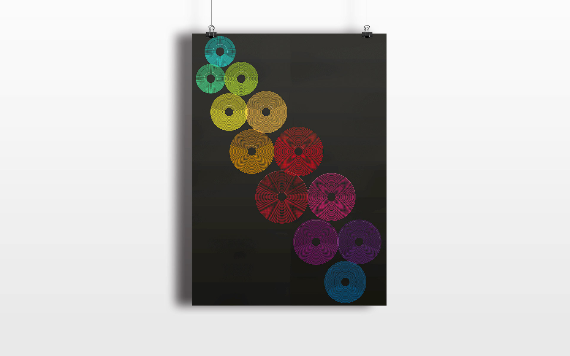
© Angelika Ziegler 2015